
(via Ester Knows.)
I can't help but postulate that our favorite mysterious conglomerate took a page from Wyman's book in designing their own logos - most likely owing to the clever, simple, and vaguely retro quality of his work. This is really well exemplified in his agency's logo (which Wyman designed, duh).

(via XOYAZ.)
There's this badassery as well:
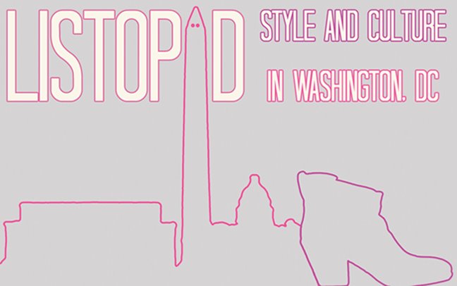
(via creativebits.)
Oy! Such swimmingly kinetic use of parallel lines! Good on ya, Lance.
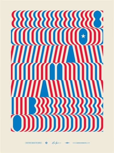
Here's another Wyman creation that you may have seen before:

I know! Jaw on floor, right?!?!


2 comments:
the word "wingdings" springs to mind...
Milton Glaser, step your game up.
Post a Comment